浮动
我们可以利用定位打破文档流,除此以外也可以利用浮动。其实浮动就是让元素进行“靠左、靠右”进行水平排列。
靠左侧浮动
1
2
3
4
5
6
7
8
9
10
11
12
13
14
15
16
17
18
19
20
21
22
23
24
25
26
27
28
29
30
<html lang="en">
<head>
<meta charset="UTF-8">
<title>浮动基本使用</title>
<style type="text/css">
*{
margin: 0;
padding: 0;
}
div{
float: left;
width: 150px;
height: 50px;
background: red;
}
</style>
</head>
<body>
<div>最近在下雨</div>
<div>最近在下雨</div>
<div>最近在下雨</div>
<div>最近在下雨</div>
<div>最近在下雨</div>
<div>最近在下雨</div>
<div>最近在下雨</div>
<div>最近在下雨</div>
<div>最近在下雨</div>
</body>
</html>

float: left;靠右侧浮动
注:一行放不下自动换行
案例——导航条
百度新闻导航条
1
2
3
4
5
6
7
8
9
10
11
12
13
14
15
16
17
18
19
20
21
22
23
24
25
26
27
28
29
30
31
32
33
34
35
36
37
38
39
40
41
42
43
44
45
46
47
48
49
50
51
52
53
54
55
56
57
58
59
60
61
62
<html lang="en">
<head>
<meta charset="UTF-8">
<title>百度导航条</title>
<style type="text/css">
*{
margin: 0;
padding: 0;
}
.box{
position: relative;
/*当前这个div的宽度是按照父元素宽度进行百分比*/
width: 100%;
height: 50px;
background: #01204f;
}
ul{
position: absolute;
left: 20%;
width: 80%;
height: 50px;
list-style: none;
}
li{
float: left;
width: 60px;
height: 50px;
color: white;
font-size: 16px;
/*行高 让文字在垂直方向*/
line-height: 50px;
/*文字居中*/
text-align: center;
cursor: pointer;
}
li:hover{
background: red;
}
</style>
</head>
<body>
<div class="box">
<ul>
<li>首页</li>
<li>国内</li>
<li>国际</li>
<li>军事</li>
<li>财经</li>
<li>娱乐</li>
<li>体育</li>
<li>互联网</li>
<li>科技</li>
<li>游戏</li>
<li>女人</li>
<li>汽车</li>
<li>房产</li>
</ul>
</div>
</body>
</html>
 + 子元素宽度可以是百分比单位,是按照父元素的宽度进行划分的
+ line-height(行高):可以让文本在垂直方向居中(最好属性值和当前元素高度一样高)
+ 子元素宽度可以是百分比单位,是按照父元素的宽度进行划分的
+ line-height(行高):可以让文本在垂直方向居中(最好属性值和当前元素高度一样高)
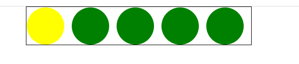
案例——轮播图的小圆球
轮播图的小圆球
1
2
3
4
5
6
7
8
9
10
11
12
13
14
15
16
17
18
19
20
21
22
23
24
25
26
27
28
29
30
31
32
33
34
35
36
37
38
39
40
41
42
43
<html lang="en">
<head>
<meta charset="UTF-8">
<title>轮播图小圆球</title>
<style type="text/css">
*{
margin: 0;
padding: 0;
}
ul{
position: relative;
width: 300px;
height: 50px;
list-style: none;
border: 1px solid black;
left: 50px;
}
li{
float: left;
/*左侧外边距*/
margin-right: 10px;
width: 50px;
height: 50px;
/*圆角设置*/
border-radius: 50%;
background: green;
}
.cur{
background: yellow;
}
</style>
</head>
<body>
<ul>
<li class="cur"></li>
<li></li>
<li></li>
<li></li>
<li></li>
</ul>
</body>
</html>
案例——四叶草
CSS中给元素添加动画:animation
web前端开发浏览器厂商常见:Google、IE、火狐、欧朋
浏览器厂商的私有前缀(带有私有前缀样式只能在当前浏览器中使用)
谷歌:webkit
IE:ms
火狐:moz
欧朋:o
四叶草
1
2
3
4
5
6
7
8
9
10
11
12
13
14
15
16
17
18
19
20
21
22
23
24
25
26
27
28
29
30
31
32
33
34
35
36
37
38
39
40
41
42
43
44
45
46
47
48
49
50
51
52
53
54
55
56
57
58
59
60
61
62
63
64
65
66
67
68
69
70
71
72
73
74
75
76
77
78
79
80
81
82
83
84
85
86
<html lang="en">
<head>
<meta charset="UTF-8">
<title>四叶草</title>
<style type="text/css">
*{
margin: 0;
padding: 0;
}
.box{
/*相对定位:相对的是自己的起始位置*/
position: relative;
width: 200px;
height: 200px;
border: 1px solid black;
left: 40%;
/*调用动画 动画执行时间一次5s,动画速率匀速 延迟时间0s 执行次数无限次*/
animation: donghua 5s linear 0s infinite;
}
.ye1{
/*绝对定位:子绝父相*/
position: absolute;
width: 100px;
height: 100px;
background: green;
left: 0px;
top: 0px;
/*设置圆角:左上、右上、右下、左下*/
border-radius: 0px 90px 0px 90px;
}
.ye2{
/*绝对定位:子绝父相*/
position: absolute;
width: 100px;
height: 100px;
background: green;
left: 100px;
top: 0px;
/*设置圆角:左上、右上、右下、左下*/
border-radius: 90px 0px 90px 0px;
}
.ye3{
/*绝对定位:子绝父相*/
position: absolute;
width: 100px;
height: 100px;
background: green;
left: 0px;
top: 100px;
/*设置圆角:左上、右上、右下、左下*/
border-radius: 90px 0px 90px 0px;
}
.ye4{
/*绝对定位:子绝父相*/
position: absolute;
width: 100px;
height: 100px;
background: green;
left: 100px;
top: 100px;
/*设置圆角:左上、右上、右下、左下*/
border-radius: 0px 90px 0px 90px;
}
/*声明一个animation动画*/
@-webkit-keyframes donghua{
from{
/*让父元素旋转360°*/
transform: rotate(0deg);
}
to{
transform: rotate(360deg);
}
}
</style>
</head>
<body>
<div class="box">
<div class="ye1"></div>
<div class="ye2"></div>
<div class="ye3"></div>
<div class="ye4"></div>
</div>
</body>
</html>

轮播图布局
很多网站受应都带有轮播图功能()
四叶草
1
2
3
4
5
6
7
8
9
10
11
12
13
14
15
16
17
18
19
20
21
22
23
24
25
26
27
28
29
30
31
32
33
34
35
36
37
38
39
40
41
42
43
44
45
46
47
48
49
50
51
52
53
54
55
56
57
58
59
60
61
62
63
64
65
66
67
68
69
70
71
72
73
74
75
76
77
78
79
80
81
82
83
84
85
86
87
88
89
90
91
92
93
94
95
96
97
98
99
100
101
102
103
104
105
106
<html lang="en">
<head>
<meta charset="UTF-8">
<title>轮播图</title>
<style type="text/css">
*{
margin: 0;
padding: 0;
}
.box{
/*相对定位*/
position: relative;
width: 520px;
height: 280px;
border: 1 px solid black;
left: 400px;v
top: 100px;
/*子元素超出了父元素,则隐藏*/
overflow: hidden;
}
ul{
position: absolute;
list-style: none;
width: 520px;
height: 280px;
}
.leftbtn{
position: absolute;
background: green;
left: 10px;
top: 100px;
width: 60px;
height: 30px;
color: white;
text-align: center;
line-height: 30px;
opacity: 0.8;
}
.rightbtn{
position: absolute;
background: green;
left: 450px;
top: 100px;
width: 60px;
height: 30px;
color: white;
text-align: center;
line-height: 30px;
opacity: 0.8;
}
ol{
position: absolute;
width: 200px;
height: 25px;
/*background: red;*/
left: 33%;
bottom: 5px;
list-style: none;
opacity: 0.8;
cursor: pointer;
}
/*后代选择器*/
ol li{
float: left;
width: 25px;
height: 25px;
background: green;
color: white;
left: 38%;
/*变为圆球*/
border-radius: 50%;
text-align: center;
line-height: 25px;
margin-right: 5px;
}
.cur{
background: skyblue;
/*进行缩放*/
transform: scale(1.2);
}
</style>
</head>
<body>
<div class="box">
<ul>
<li><img src="1.jpg"></li>
<li><img src="1.jpg"></li>
<li><img src="1.jpg"></li>
<li><img src="1.jpg"></li>
<li><img src="1.jpg"></li>
</ul>
<!-- 做左右按钮 -->
<div class="leftbtn">left</div>
<div class="rightbtn">right</div>
<!-- 分页器 -->
<ol>
<li class="cur">1</li>
<li>2</li>
<li>3</li>
<li>4</li>
<li>5</li>
</ol>
</div>
</body>
</html>
注意:transform可以让元素实现变化:旋转、平移、缩放
- 旋转(单位:度数deg):让元素按照图像几何中心旋转
transform:rotate(30deg) - 缩放:等比让元素宽度和高度缩放
transform:scale(1.2)